
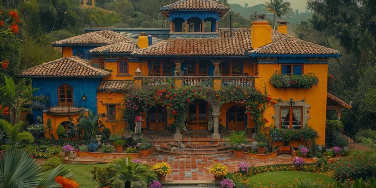
The exterior colour of your home creates the first impression long before anyone steps through the front door. The right combination can highlight architectural features, make a compact facade appear more spacious, and give even a simple home a polished appearance. In India, exterior colours also need to work with strong sunlight, seasonal rain, dust, surrounding buildings, and the architectural character of the neighbourhood.
Choosing an exterior palette should therefore involve more than picking two shades that look attractive on a paint card. The colour of the main walls, trims, doors, balconies, compound walls, windows, and architectural details should work together.
If you are looking for home exterior color combinations in India, the following ideas cover everything from understated neutral palettes to bold combinations.
45 Stunning House Colour Combinations for Outside Walls
1. White and Charcoal Grey
White creates a clean base, while charcoal grey adds depth around balconies, columns, window frames, or the entrance. This is an excellent choice for modern architecture.
2. Cream and Coffee Brown
Cream keeps the facade warm and welcoming, while coffee brown adds an earthy contrast. This combination works particularly well on traditional Indian homes.
3. Ivory and Olive Green
Ivory provides brightness while olive green introduces a natural character. It works beautifully for homes surrounded by plants, gardens, or mature trees.
4. Light Grey and White
A refined combination for houses, light grey provides a subtle base while white highlights architectural edges and creates a crisp finish.
5. Beige and Dark Brown
Beige and dark brown create a warm, sophisticated exterior without appearing overly dramatic. They are particularly suitable for villas and larger independent homes.
6. White and Navy Blue
Navy adds personality to a white facade without making it excessively colourful. Use navy for selected walls, balcony sections, doors, or architectural projections.
7. Sand Beige and Terracotta
For homeowners who prefer earthy interiors and exteriors, sand beige combined with terracotta creates a warm facade with strong visual character.
8. Pearl White and Slate Grey
This is a sleek option for architecture. Slate grey can be used on feature walls while pearl white keeps the overall exterior bright.
9. Soft Peach and Warm White
Soft peach gives the facade a welcoming appearance, while warm white prevents the combination from becoming too bright. It suits both modern and traditional homes.
10. Sage Green and Cream
Sage green has a softer appearance than brighter greens. Combined with cream, it creates a calm exterior that works especially well with wooden doors and natural stone.
11. White and Teak Brown
A white facade with teak-brown accents creates a premium appearance. The brown can be introduced through the main door, balcony details, windows, or selected exterior walls.
12. Greige and White
Greige combines the warmth of beige with the sophistication of grey. White trims provide contrast, making this an excellent choice for minimalist architecture.
13. Light Blue and White
Light blue creates a fresh and airy appearance, particularly when paired with crisp white trims. It works well in homes that receive strong natural sunlight.
14. Charcoal and Warm Beige
Charcoal provides a fine foundation while warm beige prevents the facade from feeling too dark. Use the darker shade selectively for the best result.
15. Mustard and Off-White
Mustard works beautifully as an accent rather than a dominant exterior colour. Pairing it with off-white creates a cheerful facade with a distinctly Indian character.
16. Terracotta and Cream
Terracotta gives the exterior an earthy, grounded quality. Cream balances its intensity and works particularly well with tiled roofs and traditional architectural details.
17. Dusty Rose and Grey
For a softervisible facade, dusty rose combined with grey provides warmth without becoming overly colourful. It is suitable for smaller independent homes and modern villas.
18. Chocolate Brown and Beige
Chocolate brown adds richness while beige keeps the facade light. Together, they create one of the more dependable outdoor colour combination for house options.
19. Forest Green and Off-White
Forest green creates a strong connection with nature, while off-white adds brightness. This combination works especially well for villas with landscaped surroundings.
20. Powder Blue and Ash Grey
Powder blue brings a subtle splash of colour, while ash grey adds a modern edge. White detailing can be introduced around windows and balconies.
21. White and Brick Red
Brick red can be used sparingly on a white facade to create warmth and visual interest. It works particularly well around entrance walls and architectural projections.
22. Taupe and Dark Grey
Taupe provides a sophisticated neutral base while dark grey defines structural elements. This palette suits homes with clean geometric forms.
23. Cream and Sage Green
Cream and sage green offer a softer alternative to traditional beige and brown combinations. The palette works well with wooden doors, stone cladding, and greenery.
24. White and Teal
Teal adds a distinctive touch when used with white. Rather than covering the entire facade, use teal strategically on feature sections or the main entrance.
25. Warm Grey and Wood Brown
A warm grey exterior combined with wood-brown accents creates a modern yet comfortable appearance. It is particularly effective for homes with large windows and wooden details.
26. Pale Yellow and White
Pale yellow brings warmth and brightness without the intensity of stronger yellow shades. White trims keep the facade fresh and balanced.
27. Beige and Olive
Beige and olive create an earthy palette that works naturally with stone, wood, and landscaping. It is a strong option for homes surrounded by greenery.
28. Navy and Light Grey
Navy provides depth while light grey softens the overall appearance. This combination suits modern villas and independent homes.
29. White and Terracotta Brown
White keeps the facade bright while terracotta brown introduces warmth. It can be used around balconies, entrance features, or lower sections of the exterior.
30. Lavender Grey and White
Lavender grey offers a subtle colour variation without appearing overly bold. White trims help maintain a clean and sophisticated facade.
31. Olive Green and Sandstone Beige
This natural palette works particularly well with stone textures. Olive adds colour while sandstone beige creates a warm connection with the surrounding landscape.
32. Charcoal, White and Wood
Using three carefully balanced colours can give a home considerable depth. Charcoal can define feature walls, white can cover the main facade, and wood tones can highlight the entrance.
33. Cream, Brown and Terracotta
This layered combination is ideal for traditional villas and homes inspired by Indian architectural styles. Each colour can be assigned to a different architectural element without making the facade look busy.
34. White, Grey and Black
A simple three-colour palette can produce a striking modern facade. White works as the primary shade, grey adds transition, and black highlights doors, window frames, or railings.
35. Beige, White and Gold
For a more luxurious appearance, beige and white can be paired with restrained gold accents. Gold works best on smaller architectural details rather than large wall surfaces.
36. Dusty Blue and Cream
Dusty blue offers colour without overpowering the architecture. Cream provides warmth and helps the combination work across both traditional and facades.
37. Maroon and Ivory
Maroon creates a rich and distinctive appearance, while ivory keeps the exterior balanced. This can be an attractive choice for larger homes with traditional architectural elements.
38. Mint Green and White
Mint green creates a fresh appearance and works especially well in bright environments. White trims and darker doors can provide enough contrast to prevent the facade from looking flat.
39. Slate Blue and Off-White
Slate blue offers more depth than traditional light blue while remaining relatively understated. Off-white trims bring balance and highlight the home’s structure.
40. Modern Beige and Charcoal
Modern beige is warm and versatile, while charcoal adds an edge. This combination works particularly well on homes with clean lines and minimalist detailing.
41. White and Dark Teal
Dark teal can create a dramatic feature wall when paired with white. The combination works particularly well around entrances, balconies, and vertical architectural sections.
42. Sandstone, White and Brown
Sandstone tones create an earthy exterior that pairs naturally with brown doors and white highlights. It is a dependable choice for villas and large independent houses.
43. Soft Yellow and Grey
Soft yellow gives the facade a welcoming quality, while grey provides a modern foundation. Use yellow selectively if the house receives strong direct sunlight.
44. Black, White and Natural Wood
For a bold exterior, black and white can be softened with natural wood accents. This combination is particularly effective on modern villas with large glass surfaces.
45. Off-White and Cinnamon Brown
Off-white provides a timeless foundation while cinnamon brown adds warmth and character. It is an elegant option for homeowners who want a subtle but distinctive exterior.
How to Choose the Right Outdoor Wall Colour Combination
Finding the right outdoor wall colour combination involves looking at the entire facade rather than choosing colours in isolation. Start by identifying the architectural style of the house. A minimalist home may look better with grey, white, charcoal, or muted earthy tones, while a traditional villa can accommodate warmer colours such as cream, terracotta, brown, or olive.
The size of the house also matters. Lighter shades generally make surfaces feel more open, while darker colours can add visual weight and define specific sections. Instead of using a dark shade across the entire facade, consider reserving it for feature walls, columns, entrance areas, or balcony sections.
Natural surroundings should also influence your choice. Homes surrounded by greenery can work beautifully with earthy shades, while houses in dense urban areas may benefit from lighter palettes that create a cleaner and brighter appearance.
How to Create a Simple House Front Colour Design
A simple house front colour design does not mean the facade needs to look plain. The key is to establish a dominant colour and introduce one or two supporting shades.
For example, warm white can cover most of the facade, charcoal can define architectural features, and natural wood can be used for the entrance. This approach creates contrast without relying on too many colours.
Pay particular attention to the main entrance. The door, surrounding wall, lighting, and pathway should complement one another because this area naturally attracts attention.
Colour Ideas for Bungalows and Large Homes
Large independent houses and villas offer more opportunities to experiment with colour because their facades typically contain multiple architectural sections.
For bungalow color combinations in India, earthy palettes such as cream and brown, beige and olive, white and terracotta, or sandstone and dark brown can complement spacious facades particularly well.
Modern bungalows can also benefit from combinations such as charcoal and white, slate blue and off-white, or black with natural wood. The important factor is proportion. A large facade can support stronger contrast, but the colours should still be distributed carefully across the architecture.
White Colour Combination for House Exterior Painting
White remains one of the most versatile choices for exterior walls because it works with almost every architectural style. However, an entirely white facade can sometimes appear flat or require more maintenance in dusty environments.
A white colour combination for house exterior painting can introduce depth by pairing white with charcoal, brown, navy, olive, grey, terracotta, or wood tones.
White and charcoal create a modern appearance, white and brown feel warm and traditional, while white and navy offer a more distinctive look. The right combination depends on the architecture and the amount of natural light the facade receives.
Understanding Colour Combination for House Front Elevation
The front elevation should be treated as a composition rather than a single wall. Windows, balconies, columns, parapets, doors, railings, and projections all contribute to the final appearance.
A successful colour combination house front elevation uses colour to highlight these features rather than hide them. A darker tone can emphasize a recessed balcony, while a lighter shade can make a projecting section stand out.
Using the same accent colour on the entrance door, window frames, and selected architectural details can also create visual consistency.
Choosing Colours for India’s Climate
Exterior paint has to withstand environmental conditions, not just look attractive when freshly applied. Strong sunlight can cause certain colours to fade, while humidity and rainfall can affect poorly prepared surfaces.
When selecting India home outside colour options, consider the local climate and exposure of the facade. Speak with your designer or paint professional about exterior-grade products designed for the specific weather conditions of your area.
Surface preparation is equally important. A good colour applied to a poorly prepared wall will not deliver the desired long-term result.
Your Exterior Should Work With Your Interior
Although exterior and interior design are different disciplines, they should still feel connected. The colour palette of the entrance, flooring, doors, and living spaces can create a smoother transition between indoors and outdoors.
For example, a home with warm wooden interiors can carry similar wood tones into the entrance. An interior dominated by cool greys can transition naturally into a grey, white, or charcoal exterior.
This is where a complete design approach becomes valuable. A professional team can coordinate exterior decisions with spaces inside the home, from the entrance and living room to the kitchen. If you are planning the interiors as well, working with experienced kitchen interior designers in Bangalore can help maintain consistency between the home’s architectural character and its interior finishes.
Why Professional Design Can Make a Difference
Choosing colour combinations is easy. Choosing the one that actually works with your home’s orientation, architecture, materials, lighting, and surroundings is much harder.
At TASA, design decisions are approached with the complete home in mind. Colour, materials, lighting, furniture, architectural details, and functionality are considered together rather than treated as separate elements. This helps create homes that look cohesive from the outside and continue that design language indoors.
Whether you prefer an understated neutral facade, a warm traditional palette, or a bold dominant exterior, professional planning can help you achieve the right balance between appearance and practicality.
Final Thoughts
Your home’s exterior deserves the same level of thought as its interiors. From timeless combinations such as white and grey to more expressive palettes involving navy, olive, terracotta, or dark teal, there are countless ways to create an attractive facade.
The best color combination for exterior house in India depends on your home’s architecture, climate, surroundings, natural lighting, and personal taste. Instead of following a trend blindly, choose colours that complement the structure and can continue to look appealing for years.
A well-planned facade does not need dozens of colours. Often, two carefully selected shades and one well-placed accent are enough to turn an ordinary exterior into a memorable one.